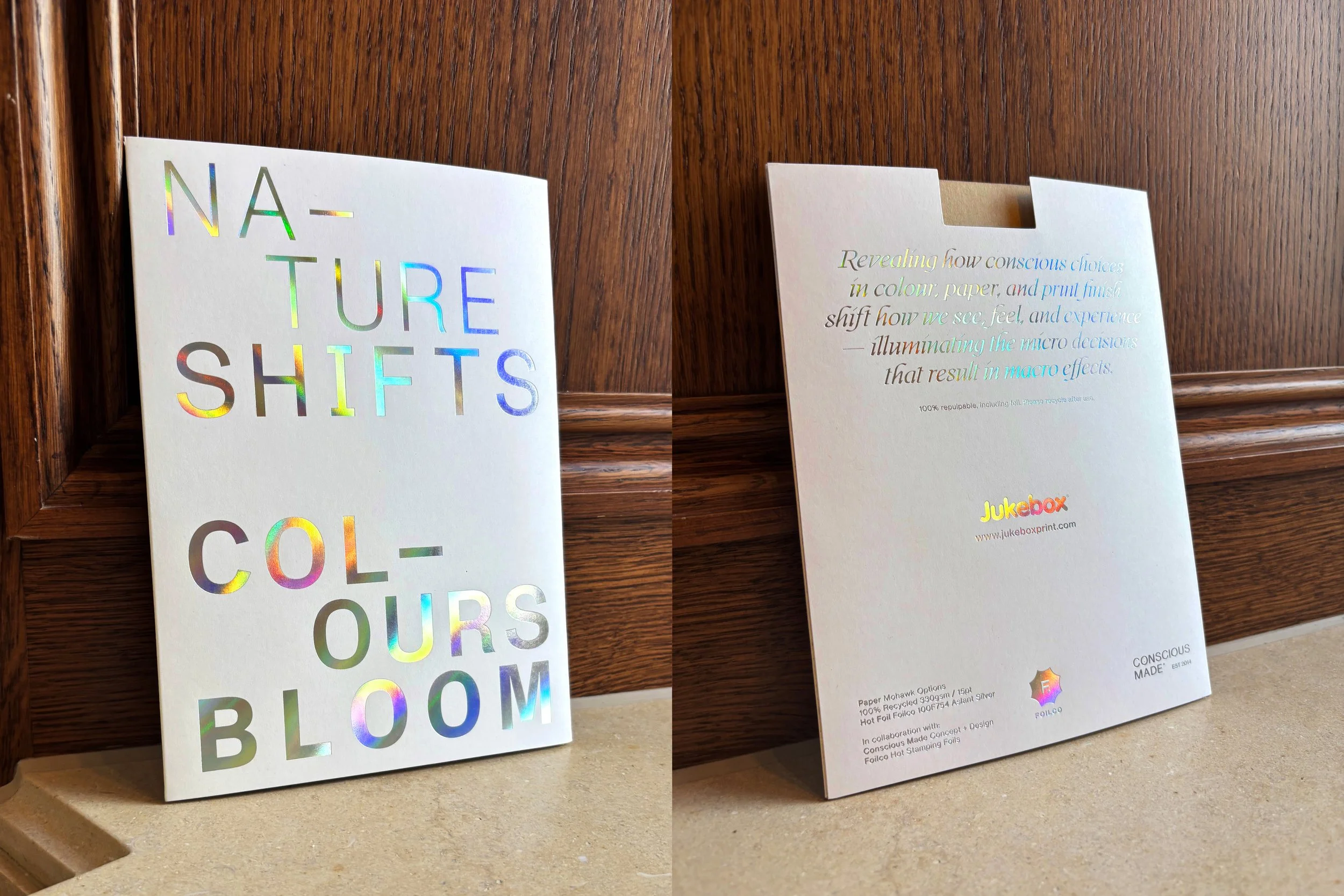
NATURE SHIFTS COLOURS BLOOM
Jukebox Print x Foilco
It's radically responsible and seriously circular but it feels elevated, not overtly earthy…
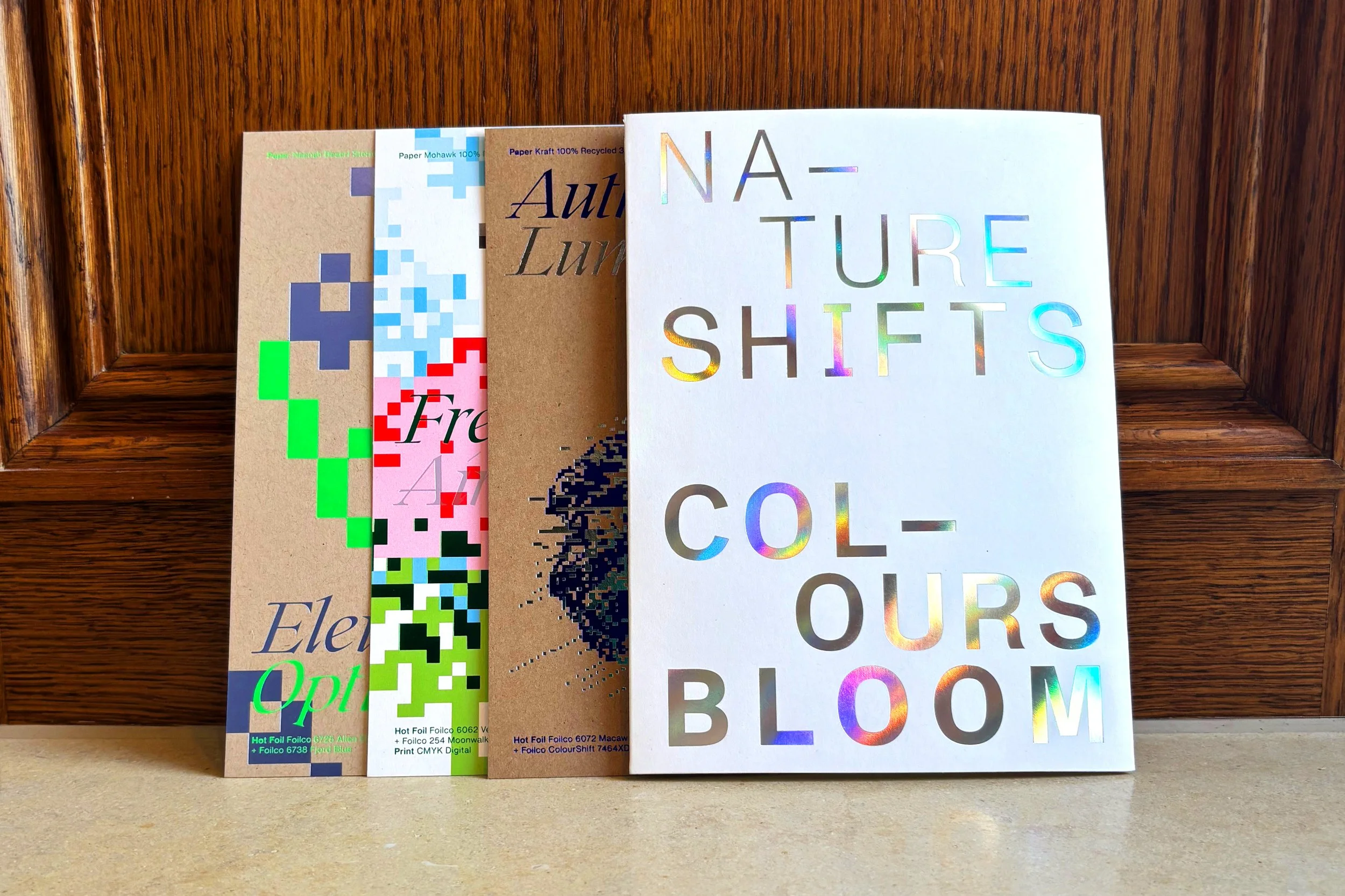
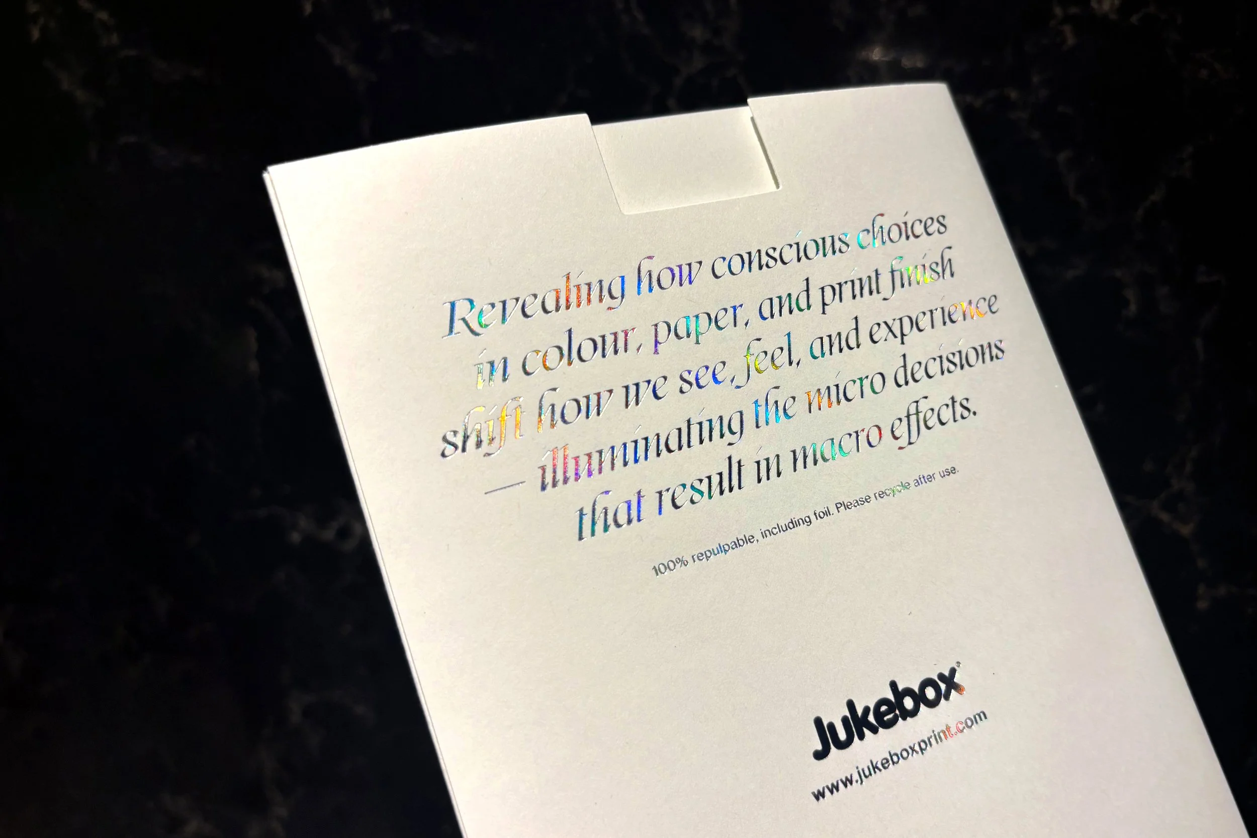
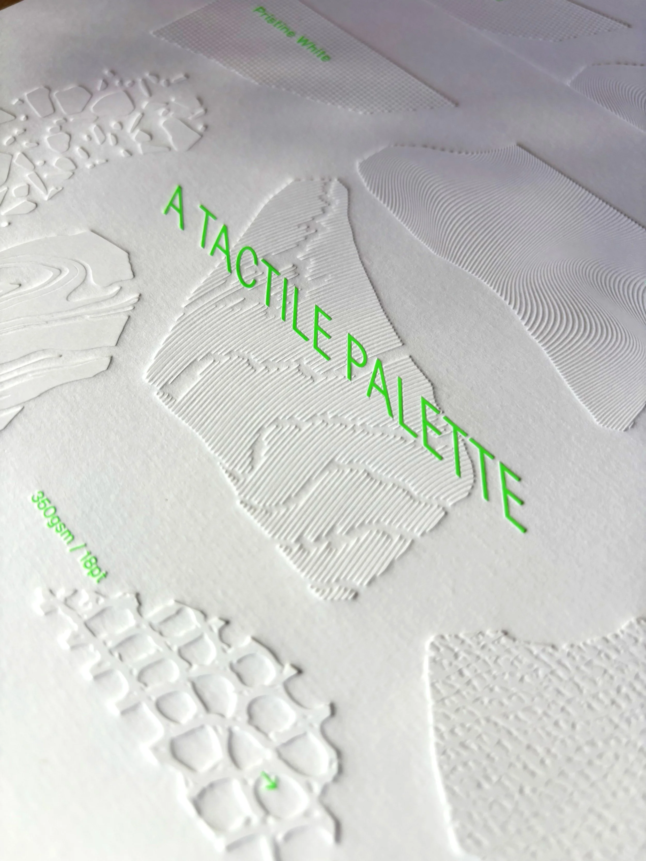
CONSCIOUS MADE initiated a self-directed project in collaboration with Jukebox Print and Foilco, exploring the creative potential of sustainable print. Centred around more challenging recycled paper stocks such as Brown Kraft, Mohawk and Neenah Desert Storm, the aim was to demonstrate how vibrant colour can still be achieved on warm, mid-dark, flecked substrates. Revealing how conscious choices in colour, paper, and print finish shift how we see, feel, and experience — illuminating the micro decisions that result in macro effects.
In this exploration, fluorescent foils were used to demonstrate the principle in action, showing how a single material choice can completely transform the outcome.
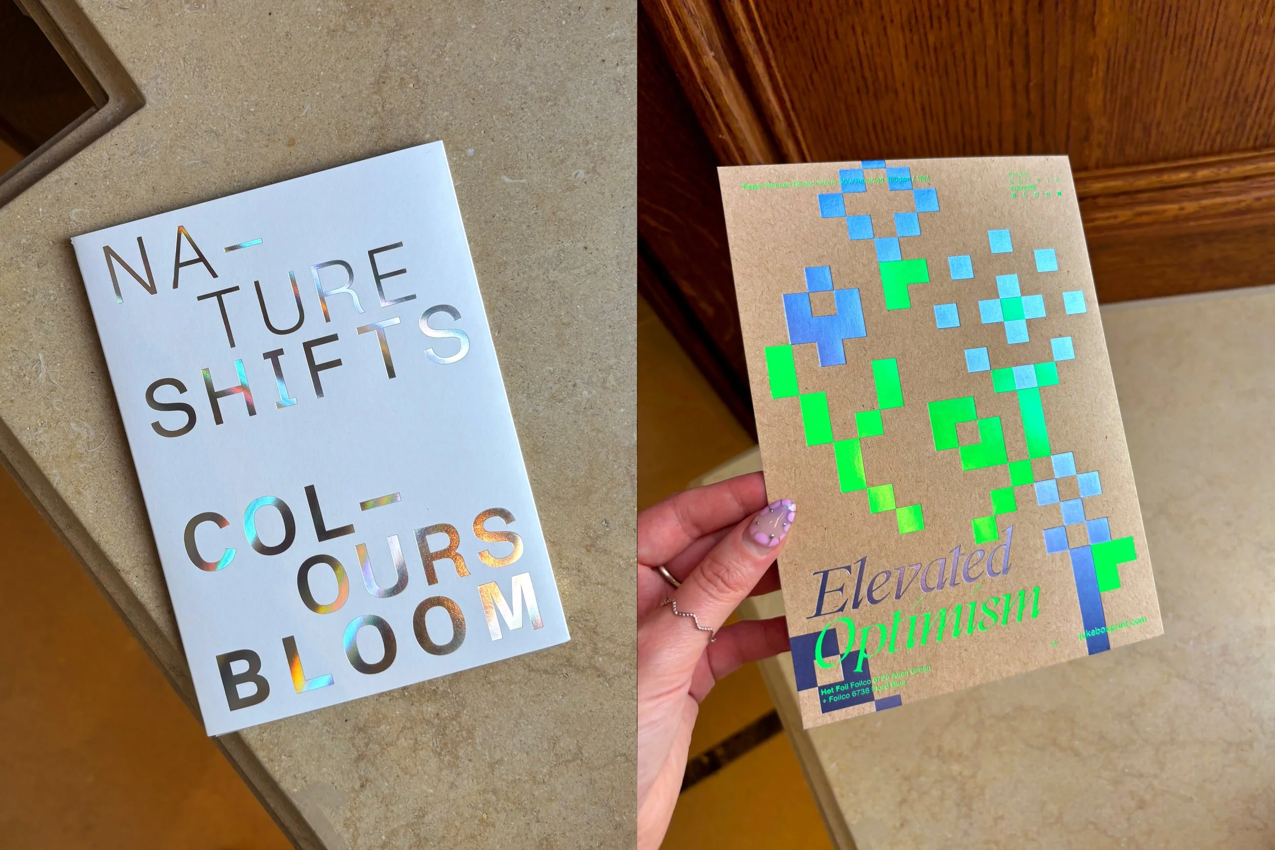
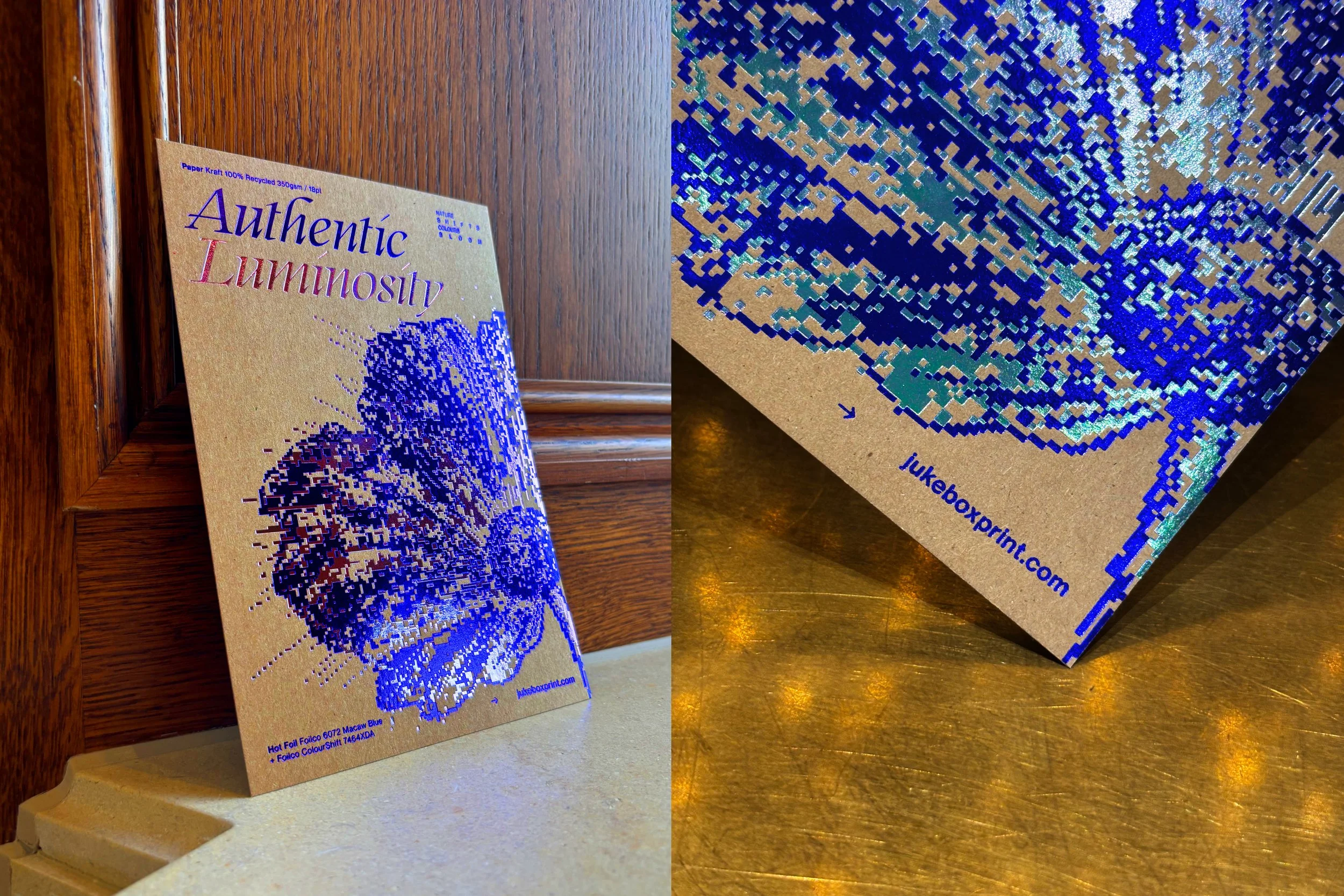
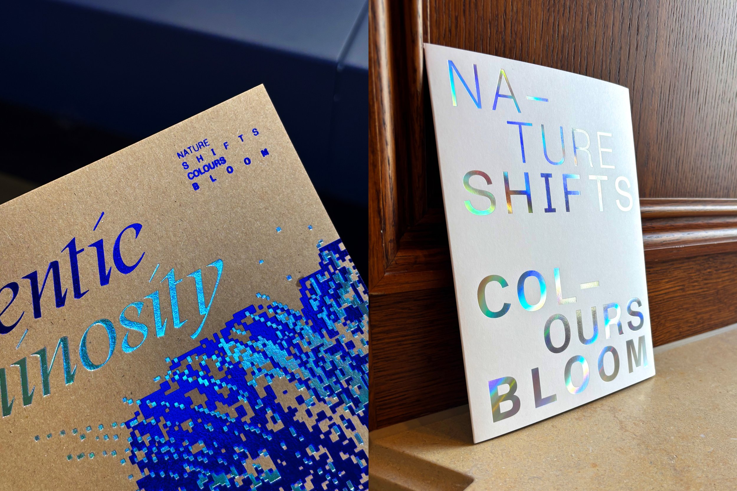
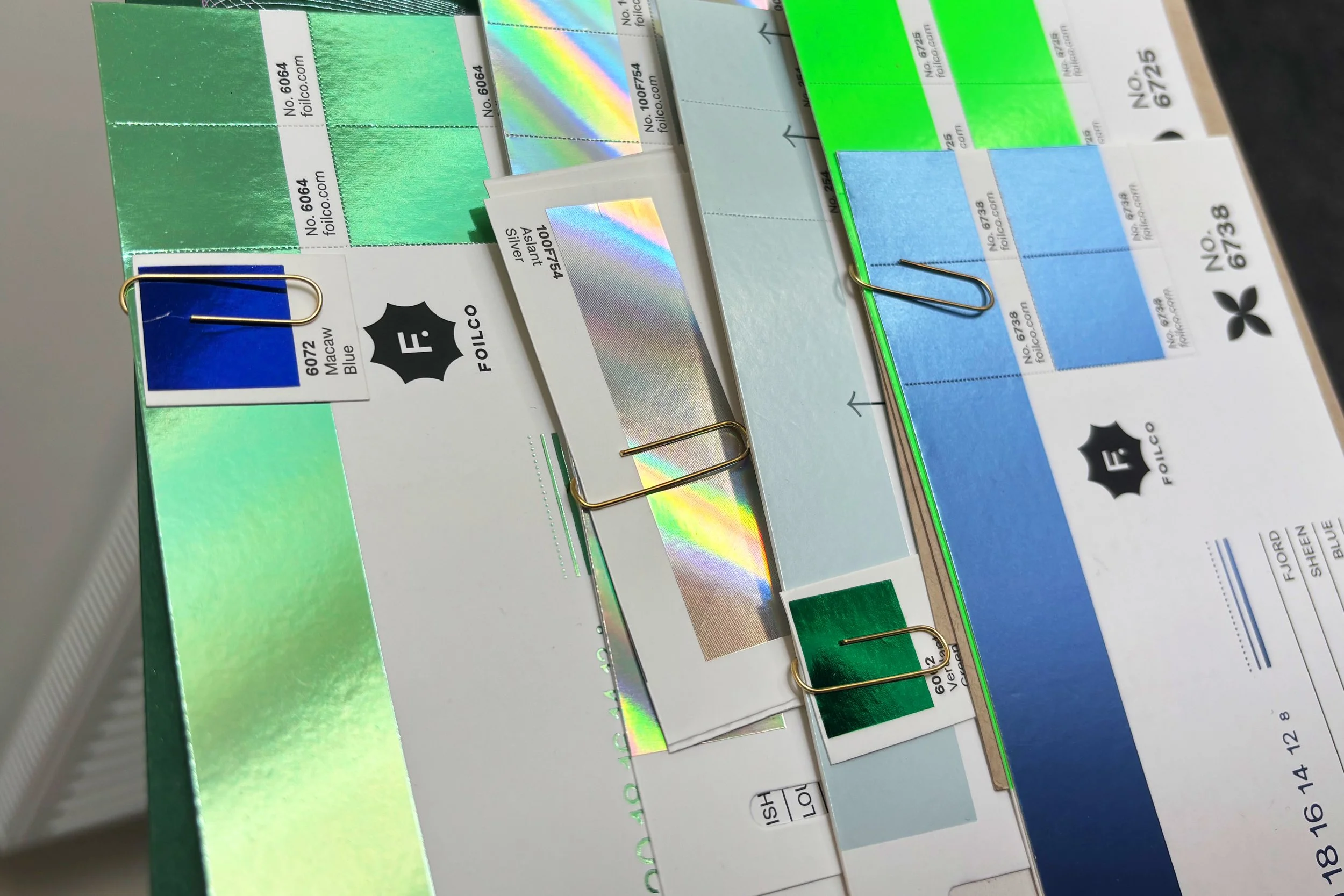
The series consisted of three cards, each exploring different CMF combinations. Card 1 was printed on Neenah stock and combined fluorescent green foil with a sheen blue foil. Card 2, on recycled off-white Mohawk, paired punchy CMYK inks in red, cyan, and green with transparent clear foil and metallic green foil, creating contrast against the uncoated paper. Card 3, on Brown Kraft, used a dark metallic blue foil alongside a ColourShift purple-to-blue foil, demonstrating how vibrant finishes can energise even the most natural substrates. Together, the set highlighted the potential of recycled and challenging stocks when paired with bold, intentional finishes — reminding us that micro choices in CMF can shift perception at a macro level.
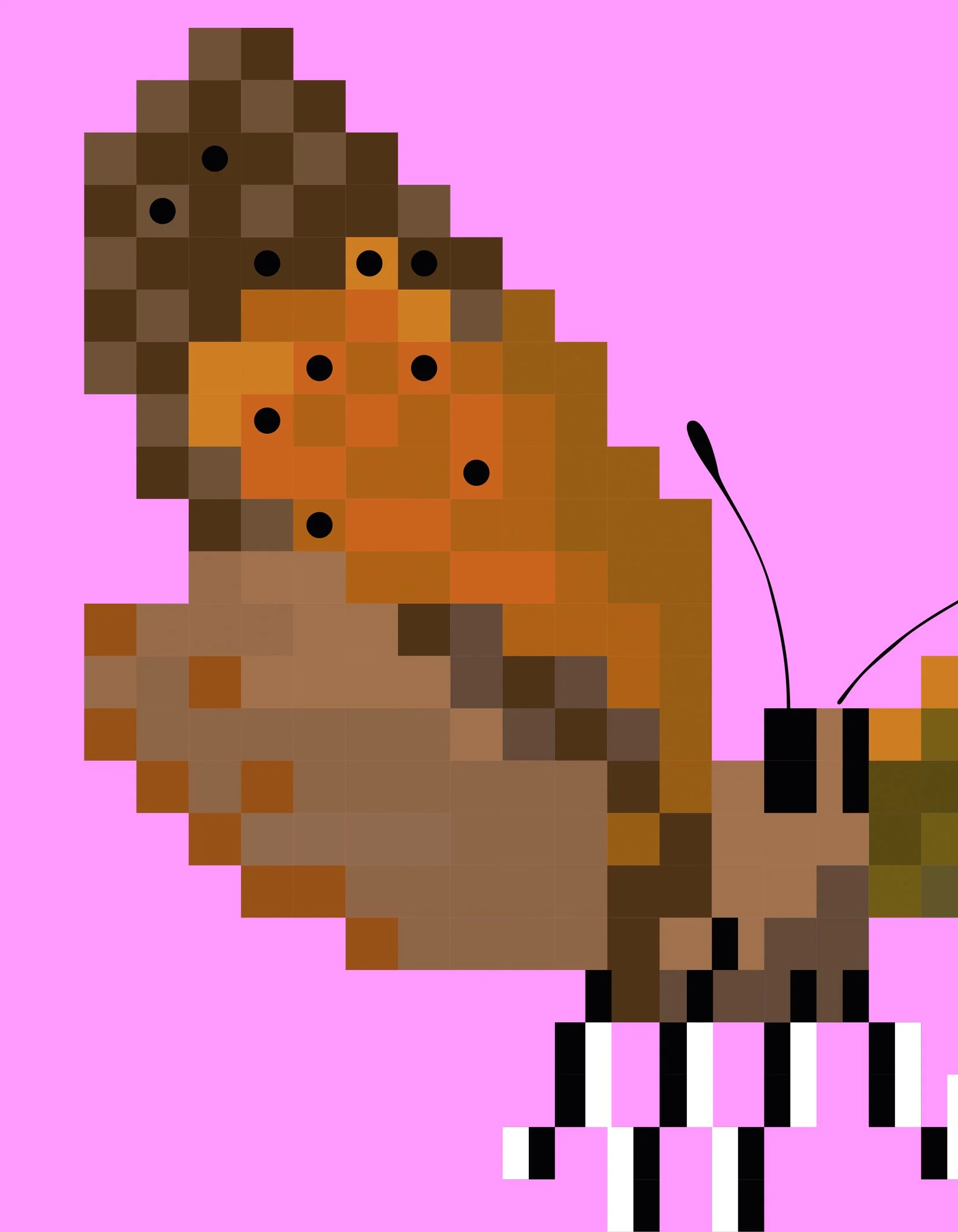
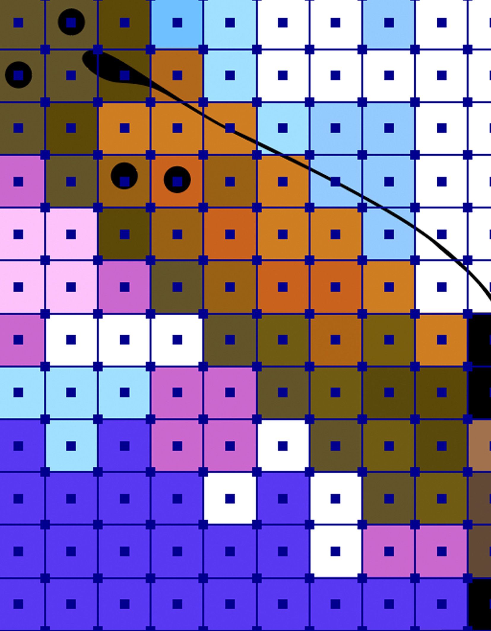
The outcome served both as an inspiration reference and a practical demonstration of what’s achievable when sustainability is prioritised. By exploring pixels at both micro and macro scales, the design symbolised how small material decisions — such as switching to recycled stock or using neon foils — can generate wider environmental benefits. The project reinforced a simple message: even the smallest adjustment in print specification can create meaningful impact, where nature responds, shifts, and colours bloom.
-
Despite their brown undertones, the outcome shows how vibrant colour can still be achieved.
The piece acts both as an inspiration reference and as a tool to demonstrate possibility. The design explores pixels at both micro and macro scales, highlighting how small choices can create larger impacts. Each flower design uses a different pixel size to symbolise the shift from micro decisions (like switching to recycled stock, or using neon foils) to macro outcomes (reducing carbon and waste).
The key message is simple: even the smallest adjustment in print specification can lead to meaningful environmental benefits — where nature responds, shifts, and colours bloom.
Featured on Fonts In Use, Design By Women, TypostersClient
Jukebox Print x Foilco
Self-initiated
Self-promotion
Project
Nature Shifts Colours Bloom
Sector
-
Year
-
Deliverables
-
Services
-
Team
CM
Photography
CM


PRINT SPECIFICATION


DESIGN DEVELOPMENT


FEDRIGONI →
FEDRIGONI →
MONDI ←
MONDI ←
MORE PROJECTS THIS WAY →

MOAS ←
MOAS ←